Deciding the Structure for GPU Draw Commands
Rendering an Aqua-like button to prove the system's viability
This is part of a series of hands-on tutorials where I share what I’m doing and learning. I won’t be sharing much copy-pasteable code; instead mostly screenshots. The idea is to get the reader to write their own code and run their own experiments.
Before proceeding, I need to make a correction regarding the blending code for the pipeline descriptor. In episode 4 I used `.One` as the blend factor for the source rgb and alpha, when it should have been `.SourceAlpha`.
This didn’t cause problems for us last time because we never had completely transparent pixels (zero alpha). This time though, we will.
In the past two episodes, we wrote the code to setup the rendering pipeline and tested that it can draw rectangles.
In today’s episode, we’ll get it to draw rounded rects and apply softness, masking, rotations, and color-gradients. We’ll then show that we can draw interesting gui elements with just these building blocks by reproducing the appearance of the “aqua” button from the initial versions of Mac OS X.
Reconsidering Requirements
In a previous episode I said that I wanted the capability to combine shapes arbitrarily, but upon further reflection, I found that not only is that not necessary, it’s not even that useful.
There are some advanced usecases for GUIs that cannot be implemented without bezier curves.
Look at this screenshot from the Go disassembly GUI tool: Lensm
There’s no way to draw the connections between the left side and the right side like this tool is doing by just combining SDF rounded rectangles.
So instead of trying to stretch SDF rectangles way beyond their plausible use cases, let’s focus on making them simple yet flexible. Enough flexibility to draw interesting UI widgets.
There’s no need to try turning it into a “draw anything” kind of system.
For cases like what’s illustrated by the above image, we’ll have to support it through some different route.
We’ll think about how to do that later.
Color Gradients
We’ve already seen (in episode 002) how to draw a rectangle with rounded corners and some rotation applied. We’ve also seen how to apply a “mask” from another rectangle that can also have rounded corners and rotation.
One thing I’ll add this time is a color gradient. I’ll keep it simple too: we specify two colors, one for the bottom of the rect, and one for the top of the rect.
Let’s try to see how to implement it in shadertoy. It should be quite simple to derive. We have a point within a rectangle. If the point is at the bottom, we use the bottom color, if it’s at the top, we use the top color, if it’s in between, we use a “mixture” of the two colors.
We can also apply a rotation to the rect and have it apply to the gradient as well:
The implication is that we can have a rotated gradient by applying a mask on top of this rectangle.
Rectangle Parameters / Properties
We’ve seen how we can “grow” rectangles to achieve rounded corners, and we’ve also seen how we can derive a “border” from an SDF. However, both of these operations are redundant in my opinion. Instead of growing the rectangle to achieve rounded corners, we can just specify the corner radius, and instead of a border, we can layer shapes or using an inverted mask.
Another change I’m introducing is regarding roations. Instead of using degrees or radians, I think it will make more sense to use turns; more specifically, “half turns”. To rotate by 45 degrees, we specify the value 0.25 for the half_turn. The Metal shading language provides `sinpi` and `cospi`, but OpenGL does not, so we have to stub it.
#define PI 3.1415926535897932384626433832795

float sinpi(float t) {
    return sin(t * PI);
}

float cospi(float t) {
    return cos(t * PI);
}
We’re introducing the following structs for the Odin side:
Rect_Props :: struct {
	center:     float2,
	half_size:  float2,
	radius:     float,
	softness:   float,
	half_turns: float,
	__padding:  float,
}

Color_Gradient :: struct {
	bottom: float4,
	top:    float4,
}
We need to duplicate these in the shader code. Note that the padding is required for alignment!
Now, all we need to add is another rect to act as a mask. Applying the additional mask is really simple, and you’ve alrady seen how to do it:
    float4 fragment_color = compute_color_from_gradient(rect, color, point);

    float m1 = compute_rect_mask(rect, point);
    float m2 = compute_rect_mask(mask, point);

    fragment_color = apply_mask(fragment_color, m1);
    fragment_color = apply_mask(fragment_color, m2);
With this, we can construct our draw rect command as follows:
Rect_Command :: struct {
	rect: Rect_Props,
	mask: Rect_Props,
	grad: Color_Gradient,
}
In the previous episodes we set the draw command to just specify the rectangle placment, without any additional properties, and we rendered it by specifying vertices on the screen.
Now, with this more complex description of a rectangle, it’s not so straight forward to specify the rectangle vertices. So I’m opting to set the vertices to the entire screen. This might be “wasteful” of GPU resources. I don’t know. But I’ve decided not to care for now. Once we start drawing hundreds or thousands of these rects then I’ll try to measure the performance impact and try to find ways to improve it if necessary. For now I’m just trying to get things going. I have no idea what the final architecture is going to be, so I don’t want to make hard decisions at this early stage. I want to give myself some slack to explore the architecture space.
In the previous episodes we had two arrays, one for rects and one for colors. This time we’re combining all the properties of the draw command into one struct, Rect_Command, and so it makes sense that we only have one array:
rect_commands := make([dynamic]Rect_Command, 0, 1024)

reset_rects :: proc() {
	clear(&rect_commands)
}

draw_rect_cmd :: proc(rect: Rect_Command) {
	append(&rect_commands, rect)
}
It also makes sense to have some helpers to handle the simple case, for example, just a rect with a single color.
draw_rect_simple :: proc(rect: Rect_Props, color: float4) {
	draw_rect_cmd({rect, rect, {color, color}})
}

draw_rect_grad :: proc(rect: Rect_Props,
	bottom_color: float4, top_color: float4)
{
	draw_rect_cmd({rect, rect, {bottom_color, top_color}})
}

draw_rect_mask_grad :: proc(rect: Rect_Props, mask: Rect_Props,
	bottom_color: float4, top_color: float4)
{
	draw_rect_cmd({rect, mask, {bottom_color, top_color}})
}
How would the shader code change in response to this?
The vertex shader, like I said, would always return a rectangle that fills the whole screen.
vertex VertexData basic_vertex(
    ushort vertex_id   [[vertex_id]],
    ushort instance_id [[instance_id]],

    constant float2 &size      [[buffer(0)]]
){
    // our vertex shader just returns one rect covering the whole screen
    // if this proves to be problematic we will visit it again later

    float2 vertices[] = {
        {1, 1}, {1, -1}, {-1, 1}, {-1, -1}
    };

    float2 points[] = {
        {size.x, 0}, {size.x, size.y}, {0, 0}, {0, size.y}
    };

    float2 v = vertices[vertex_id];

    VertexData out;

    out.position = float4(v, 0, 1);
    out.instance_id = instance_id;
    out.point = points[vertex_id];

    return out;
}
The fragment shader picks out the command from the command buffer and then draws it.
fragment float4 basic_fragment(
    VertexData data [[stage_in]],
    constant Rect_Command *rect_commands  [[buffer(0)]]
) {
    int iid = data.instance_id;
    Rect_Command cmd = rect_commands[iid];
    return compute_rect_command_color(cmd, data.point);
}
As you can tell from the parameters, I’m now only sending the command buffer to the fragment shader, not the vertex shader.
size_bytes  := mem.ptr_to_bytes(&frame_data.size)
rects_bytes := mem.slice_to_bytes(rect_commands[:])

// vertex buffers
command_encoder->setVertexBytes(size_bytes, 0)  // buffer(0)

// fragment buffers
command_encoder->setFragmentBytes(rects_bytes, 0) // buffer(0)

instance_count := cast(NS.UInteger) len(rect_commands)
command_encoder->drawPrimitivesWithInstanceCount(.TriangleStrip, 0, 4, instance_count)
With that in place, let’s use this capacity to draw some interesting widgets.
Aqua Button
Here’s a picture I found on the internet of the aqua style buttons from the early days of OS X
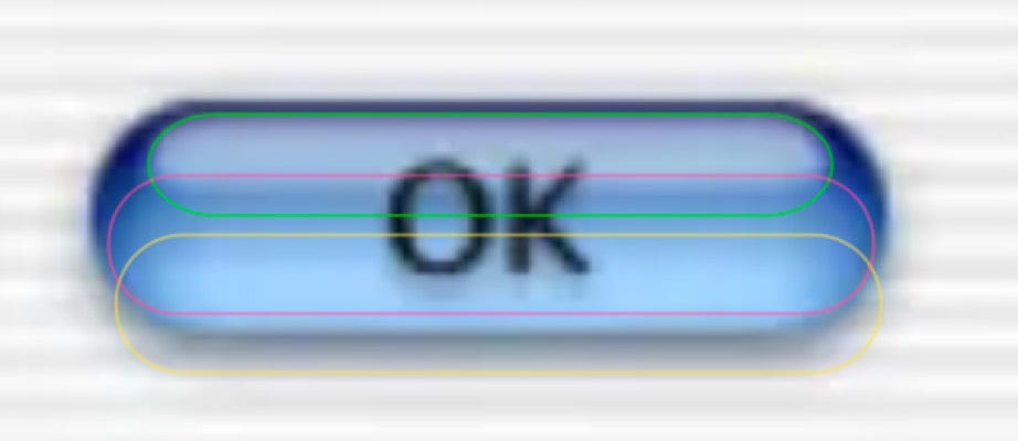
I want to recreate the blue aqua button. I don’t know about you but I see the following shapes within the button:
One outside pill in dark blue.
One small pill on the top as a reflection glow.
One inner white gradient pill as a diffuse inner glow.
One buttom more bright pill at the bottom.
Here’s my attempt to help you see the shapes that I’m seeing:
The inner glow pills are clipped by the shape of the button.
There’s also the shadow but I didn’t mention it because it’s kind of obvious.
Now, let’s try to reproduce that thing, step by step.
I’ll change the frame_proc content to just a single call to draw an aqua button
frame_proc :: proc(data: gpui.Frame_Data) {
	draw_aqua_button({100, 80}, {120, 34})
}
The values here, unlike else where, are top_left and width_height. Why? Because I envision GUI builder code to want to specify widget placement that way, rather than center and half_size. It appears more natural (or maybe I’m just used to doing it that way).
So let’s start filling out the draw_aqua_button proc.
In the picture below, you’ll see the base layer. The code to draw it along with the resulting window.
Now, it actually takes a lot of fiddling around with sizes and colors and bluriness and alpha values (transparency) to get a decent approximation. Instead of showing you all the things I tried, I’ll just show you how we get the final result by laying things on.
We have the base layer, let’s add the upper glow.
We basically take the “rect” for the button, and make a few changes to it: move it to the top, shrink it vertically, reduce it horizontally a little bit, add a tiny amout of blurriness, and fill it with a while color gradient that is nearly transparent at the bottom.
Next let add the bottom glow. Again the same idea. Take the button rect, move it to the bottom, shrink it vertically, and so on. For the color value, instead of white, we’re using a kind of bright blue. I just found these values by trial and error.
Now it looks a bit weird, but not to worry. The next step should mostly fix it.
We’ll add the “middle” or “internal” glow.
Now we just need to add the shadow. Since it’s at the very bottom, we’ll draw it the very first thing. And since drawing drop shadows is a common thing we’ll want to do with many widgets, I extracted it to a function.
Now, drawing a shadow should be pretty straight forward. We just move the rect a little bit down, and we blur it by increasing the “softness” value. Now, unfortunately, just increasing the softness value does not really create a nice round blur, specially when the corner radius values are small. This is because the softness is on both sides of the border. I found by trial that by increasing the radius, the weird effects go away.
Now, we insert the call to draw_shadow right before we draw the button base:
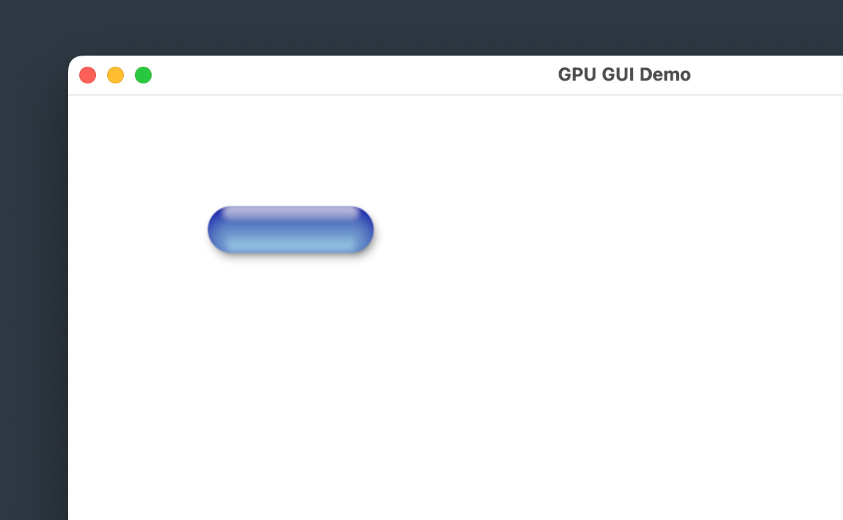
And here’s the final result.
Pretty decent, don’t you think? I mean, I’m not an artist, and my goal is not to create an exact replica, but I think this shows that we can approximate it pretty decently by only layering on sdf round rectangles. I don’t think you can reproduce this kind of result in css that easily. Doing a little bit of googling, the only decent-looking result on codepen has over 300 lines of css.
Next Steps
Now we have a basic drawing system that allows us to draw widgets. To make this useful, we need a system for widget layout. However, we’re getting ahead of ourselves here. A GUI system that cannot render text is useless. So before we get to widget layout, we need to render text, and the first step to rendering text is to render individual characters.
I’ll be use FreeType to load fonts and render individual glyphs. The library can render glyphs into an SDF (signed distance field), so we’ll make use of that.
See you next time!


